Design
Small business web design trends 2026: what’s worth following
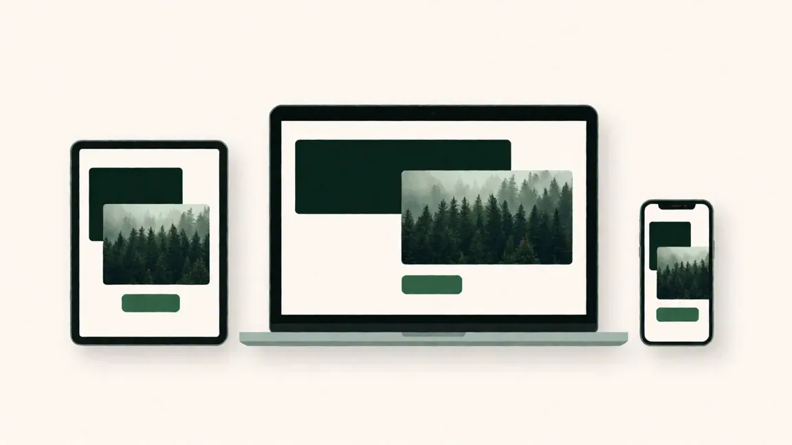
Every year brings a fresh wave of "must-have" design trends. Some of them genuinely make websites better. Others look great in an awards gallery and terrible on a plumber's homepage viewed on a phone in the car park.
If you run a small business, you don't need to chase every trend. You need the ones that make your site faster, clearer and easier to use, because those are the ones that bring in work.
Here's where we land. The web design trends of 2026 worth following are about performance and clarity, not flashy effects. Fast pages, readable type, real photos and one clear call to action per page. The trends to skip are the ones that slow your site down or make it harder to use.
Below, we break down what's driving design this year, seven trends worth following, five to skip and how to keep your site looking good long after this year's trends have moved on.
The big picture: what's driving design in 2026
Before we get to specific trends, it helps to know what's pushing them. Four things are shaping small business web design this year.
- Speed counts towards your Google ranking. Google's Core Web Vitals measure how quickly your pages load, respond and settle. Slow, jumpy pages rank lower and lose visitors.
- Accessibility is no longer optional. Your site should work for people using screen readers, keyboard navigation or larger text. In Australia, the Disability Discrimination Act applies to websites, and the WCAG guidelines are the standard most businesses work to.
- AI-generated design is everywhere. It's never been easier to make a website that looks like every other website. Human, specific design is now the thing that stands out.
- Mobile-first is simply the default. Most of your visitors are on a phone. Designing for mobile first and scaling up is just how good sites are built now.
Web design trends worth following
These are the small business web design trends we'd actually recommend. None of them are flashy. All of them help.
1. Performance-first design
Lightweight pages, compressed images and fewer heavy scripts. A fast site feels more professional before anyone reads a word, and it helps your ranking too.
2. Bold, readable typography
Big, confident headings and comfortable body text. Typography is doing more of the visual work in 2026, which means fewer decorative extras and a cleaner page.
3. Small animations, used with restraint
A button that responds when you hover, a section that fades in gently as you scroll. Subtle motion makes a site feel polished. The key word is subtle.
4. Real photography over stock
Photos of your actual team, workspace and work build trust in a way stock photos never will. Customers can tell the difference, even if they can't say why.
5. One primary call to action per page
Every page should have one main thing you want visitors to do. Give it one clear button and make it easy to find.
6. Sticky calls to action on mobile
A "Call now" or "Get a quote" button that stays at the bottom of the screen as people scroll. Small change, real results for service businesses.
7. Descriptive button text
"Get your free quote" tells people what happens next. "Submit" doesn't. It's a tiny detail that makes a site easier to use.
Trends to skip (or use very carefully)
Some trends look impressive in a portfolio but cause real problems on a business website. Here's what we'd steer clear of.
- Heavy parallax scrolling. Backgrounds that move at a different speed to the page look slick on a big screen. On a phone, they're often slow, jerky and disorienting.
- Autoplay video backgrounds. They make pages heavy, eat into mobile data and distract from your message. If you have a great video, put it somewhere people can choose to press play.
- Complex scroll-triggered animations. Text flying in from every direction might suit a creative agency. For a business site, it mostly slows people down on the way to your phone number.
- Custom cursors and scrollbars. They break what people expect and can make a site harder to use, especially for anyone relying on accessibility tools. Just don't.
- Generic AI-made layouts. The same hero image, the same three feature boxes, the same gradient. Visitors are starting to recognise the look, and it doesn't build trust.
There's a pattern here. Every trend on this list puts the effect ahead of the visitor. Every trend on the first list does the opposite.
How to stay timeless, not trendy
The websites that still look good five years later rarely followed every trend. They got the basics right and kept things simple.
- Choose clarity over cleverness. If a visitor has to work out how your site works, it's too clever.
- Invest in typography and spacing. Good type and generous white space never really go out of style.
- Stick to a consistent colour palette. Two or three brand colours, used the same way on every page.
- Put the user experience first. Fast, easy to read, easy to contact you. That's most of the job.
- Work with a designer who understands business. Someone who asks about your customers before they show you mood boards.
A timeless site also costs less over time. You won't need a redesign every time the trends shift, just regular care and the occasional refresh. Our website redesign checklist will tell you when it's actually time.
Making trends work for your business
The smartest approach to web design trends for small business is to be picky. Take the ones that make your site faster and clearer, ignore the ones that are just for show, and keep your focus on the people visiting your site.
That's how we design at Webbros. Every site we build is fast, accessible and built around what your customers need, with just enough personality to feel like you. Find out more about our web design services, or compare what's included in each package.
Fast, clear and built to last.
FAQ
Should I follow every web design trend?
No. Pick the trends that fit your brand and make your site faster or easier to use, and skip the rest. Chasing every trend means redesigning more often and usually ends with a site that feels busy. A clear, simple design will outlast most trends.
How often should I update my website design?
Most small businesses need a full redesign every 3–5 years, with small updates in between. If your branding, services or customers change significantly, you may need one sooner. Regular maintenance keeps everything running smoothly between redesigns.
What's the biggest web design trend in 2026?
Performance and accessibility. Fast-loading pages that work for everyone, on every device, matter more this year than any visual effect. They help your Google ranking, keep visitors on your site and make it easier for people to contact you.
Is minimalist design still in style?
Clean, uncluttered design is still the safest choice for most small businesses. What's changed is that "minimal" now often means bolder typography and real photos, rather than lots of empty space and thin grey text.